5 Data Visualization Techniques that Will Make You a Visualization Ace

Proper data visualization techniques go beyond presenting facts. It is about building impactful reports in a way that communicates meaningful insights, or as some say, ‘answer questions you did not know how to ask.’
As a data scientist, the value you add to businesses, governments, and other institutions provide a basis for evidence-based decision-making and strategies. And I would argue that the presentation of data determines the success of commercial and social endeavors.
Data visualization is the process of transforming raw dry data into a graphical representation of information. Elements such as graphs, charts and maps, and other forms of visual representation of data make it possible to comprehend trends, patterns, and anomalies in the subject of analysis.
Top 5 Easy To Apply Data Visualization Techniques
Here are visualization techniques bound to sharpen your skills and enhance the quality of insights you draw from data you visualize.
1. Know Your Goal
Goal setting is among the fundamentals of data visualization. You can only have one of three goals for visualization – explore, explain, or a hybrid of the two.
As the name suggests, exploratory data visualization is when you have data, but you are not sure about what is in it. It helps you discover the story the data has to tell. After you get a sense of what is inside that data, you can determine its features, trends, and outliers.
Explanatory data visualization is when you visualize the data to explain a particular phenomenon. You already know what is inside in the data at this stage, and you work towards presenting it as evidence that will guide decision making.
Often exploratory visualization is the analysis stage, and explanatory visualization comes at the presentation stage of the data visualization cycle.
Other times, which makes for one of the best data visualization examples, you may want to provide an environment where your audience has an immersive experience with the data. To achieve this, you give a curated dataset to allow the reader to explore and find answers (explanations) for themselves.
A hybrid of exploratory and explanatory data visualization creates an immersive experience. In such a situation, you present the data via an interactive graphical interface. The interface allows the audience to choose and combine different aspects of the data and discover for themselves invaluable insights.
Exploration-explanation visualization allows for a participatory environment that empowers your readers to draw insights you may have never considered. The audience’s freedom to explore is what makes it possibly one of the most effective ways of ripping the full benefits of data visualization.
2. Tell Stories
Your data must tell a story. As you grow in your data science career, you will find that there are no two ways about it. Storytelling is an essential aspect of data visualization principles. Stories will make the visual data memorable, meaningful, and equips you to communicate insights.
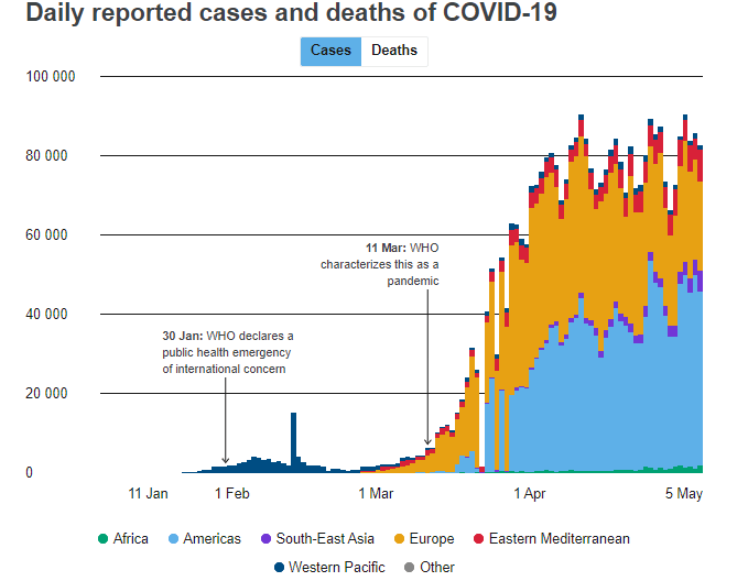
Recognizing the importance of telling stories using data, the World Health Organization has a tab on its website, a page they call data stories. WHO graphics offer one of the best data visualization examples and case studies.
For instance, the chart below tells the story of the spread of COVID-19 around the globe. With just a glance, any person looking at the chart gets a full understanding of the pandemic’s history and trajectory. With this, WHO, countries, and other regional bodies know to get information on which part of the word is vulnerable, where to send resources, increase awareness efforts, and other possible interventions.
Storytelling works by crafting narratives from the visual data available. The data serves as evidence that the story you tell is honest and authentic.
The underlying assumption here is that you are aware of and bound to the ethics of storytelling. We assume that you will use the data to tell intelligent and meaningful stories and not stories that disenfranchise people or deepen stereotypes.
3. Use of Colour Theory and Graphic Design Principles
Here is an invaluable data visualization tip – apply color theory. Color theory is a vast subject. It entails detailed aspects of matching colors, using complementary colors, and color psychology. Use all these aspects. Use the color theory and color wheel and combine the colors that go well together. And because we are emotional beings, apply colors having in mind how color stir up emotion.
Colour theory is actually a part of graphic design. So, when choosing how to visualize your data, acquaint yourself with the other graphic design principles. For instance, always ensure that there is an order to which you arrange/present data.
Undertake some light research on the importance of balance, alignment, and visual hierarchy as concepts of design. Now you know about color, learn something about the importance of negative space and typography when creating visuals.
4. Pick the Right Visuals
Suitable data visualization methods help an audience read and accurately interpret information at a glance. The visuals you pick will make and break the interpretation of the information you present. So, you have to be conscious of the visual formats available to your disposal.
There are many more visual formats to choose from, so we put together the most common and useful six as follows –
- Pie, doughnut, bar, line charts – Pie and donut charts are ideal for visualizing part to whole comparisons and propositions. These formats are suitable for an audience only interested in a quick summary and key takes aways. Bar charts, on the other hand, also work well with simple and straightforward data without too many variables.
- Histogram – A histogram is useful for visualizing the distribution of data over a continuous interval.
- Scatter plot – Present the correlation between the variables plotted along the axes.
- Word clouds – Useful for visualizing text data, mostly applied in presenting keyword tags on websites.
- A box and whisker plot – Also known as box plot, is used to summarize data sets measured on an interval scale.
- Heat map – Is a graphical representation of data that presents values as color. In the financial markets, say among forex broker companies, you will find multiple data visualization examples of heat maps. Within the forex industry, they are specifically known as currency heat maps and visually present strong and weak currencies.
5. Identify Right Tools
Remember the first point I made about your goals? When choosing your tool, the first thing you consider is determining if you are doing exploratory or explanatory visualization. Explanatory graphics only present what is essential, which is the conclusions to be made from the data.
On the other hand, exploratory graphics are designed to help you reach a conclusion of what is essential within the data.
Secondly, some of the data visualization best practices follow this one crucial rule when choosing tools – form follows function.. The structure of the visualization should follow the function/purpose. Ask yourself, what questions are you trying to ask or answer? What are the properties of the data? And lastly, how do you want to present the insights you have drawn from the data?
Now that you have an idea of what you need to visualize, choose to work with tools with an intuitive dashboard. It will make your process less arduous and your results clear.
In our opinion, some of the most institutive tools are Tableau (and Tableau Public) and QlikView.
Critical Lessons from Bad Data Visualization Examples
We took time to look at some of the bad examples of data visualization. However, since it is not in our style to amplify bad examples, we thought we would outline two key insights we gathered from the bad examples:
- Do not clump information together – Since the pandemic, there are many examples of data visualizations providing, for instance, an overview of the situation in countries and regions. Many institutions give snapshots of infection rates and death per capita. At a time such as this, information is crucial. However, we notice that most snapshots suffered what is called a visual blot. Most of the presentations we looked at had too many numbers, and flat icons clumped together on a digital canvas with very little negative space.
Like I mentioned earlier, make use of negative space. Always ensure that all the available information is visible. Try not to arrange your data in such a way that one has to zoom in to see some aspect of the visual.
If you stick to the techniques we shared earlier, especially on the use of color and application of graphic design principles, you will most certainly avoid this mistake.
- Confusing x and y-axis values – We also found that almost all charts with an x and y-axis that serve as a bad data visualization example had crossed changed values along the x and y-axis. The only way to avoid such a mistake is by being attentive and careful while working on data visualization projects. A mixed-up presentation of information can alter your company’s course in the wrong direction, which may lead to loss of money, livelihoods, and even lives depending on the context.
Final Thoughts
We trust that this short but comprehensive guide has equipped you to ace all your visualization projects. The methods I have shared in this article are meant to work together in a complementary fashion.
In summary, first, know your goals. Are you exploring the data, or do you already know what is in it? And do you just seek to present or explain a particular phenomenon?
Secondly, always seek to tell a story. The ability to create and tell stories is evidence of our consciousness, which makes us human. Next, understand color theory and have in mind graphic design concepts.
Graphic design concepts will make your visuals attractive and will capture the imagination of your audience. The fourth and fifth technique is to pick the right visuals and produce them through the right tools.
For now, that is all we have on data visualization techniques. Sign up to our newsletter so that you never miss out on many of such tips and insights.