Seaborn Vs Matplotlib: Python Visualization Tools Battle

Data is important but it cannot be meaningful or useful until it can be properly interpreted and clearly understood. If we must see the complete use of Data, then we need to be able to analysis it, no matter the size, and make sense of it quickly.
And this is where Data visualization tools come in. They give us exactly what we need: a way to create a graphical representation of Data so that even the largest chunk of data can be interpreted and understood.
Python is one language that has given us some of the best Data visualization tools with the most common being Matplotlib Seaborn and Plotly. Today we will be comparing Seaborn vs Matplotlib to see how they stack against each other when it comes to data visualization.
What is Matplotlib
Matplotlib was introduced to the world by John D. Hunter in 2002 as the first and original Python visualization tool. It started off being used to create statistical interferences and for plotting arrays into 2D graphs.
As a free and open-source library, Matplotlib uses Pyplot to create an interface that resembles Matlab making it a very powerful tool.
In the simplest form, Matplotlib is a Python library that combines other libraries such as NumPy and Pandas to create graphs.
As the first Python to ever be built, it now serves as the foundation upon which every other Python library is built.
What is Seaborn
Seaborn is another Python library that is used for data visualization. It is built on top Matplotlib and even considered its superset yet it has its unique features and stands aloof distinctively from Matplotlib. Unlike Matplotlib, Seaborn depends largely on Pandas to help it create beautiful graphical illustrations from both bivariate and univariate datasets.
Seaborn is important for creating Linear Regression Models as well as using statistical Time-Series Data to create graphs. These graphs lack the overlapping challenges usually associated with Matplotlib graphs.
Also, Seaborn comes with themes that help to make the graphs created to appear more aesthetically appealing. It can even be used to add beautification to graphs originally created with Matplotlib.
How to Work with Matplotlib and Seaborn
To fully understand how important Data visualization libraries are, we must also understand how to put them to work. Here, we will look at a simple way to work with both Seaborn and Matplotlib, two of every developer’s favorites.
Creating Histogram Using Matplotlib
We can create a simple histogram depicting danceability and energy scores using Matplotlib. But first, we need to import the Pandas library which Matplotlib needs to work properly:
import	pandas	as	pd
df = pd.DataFrame(pd.read_csv('featuresdf.csv'))
Then we can import the Matplotlib library with the short line of code below:
import	matplotlib.pyplot		as	plt
%matplotlib inline
Next, we can use the lines of code below to plot a histogram showing all the energy scores and danceability overlaid:
#set	figure
f, ax = plt.subplots(1,1)

#graph	histogram
plt.hist(df['danceability'], bins=10, alpha=0.5,
color='purple',	label='Danceability')
plt.hist(df['energy'], bins=10, alpha = 0.5, color='blue',
label='Energy')

#set	legend
plt.legend(loc='upper right')

#set	title	&	axis	titles
ax.set_title('Danceability	Histogram',	fontsize=20)
ax.set_xlabel('Danceability')
ax.set_ylabel('Frequency')

#set	x	&	y	ranges
plt.xlim(0,1)
plt.ylim(0, 30)


plt.show()
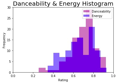
The result would resemble the histogram below:
Creating Histogram Using Seaborn
The above histogram can be made even more beautiful by bringing Seaborn into the mix. Simply import the Seaborn library into the lines of codes above:
import	seaborn	as	sns
sns.set(style='darkgrid')
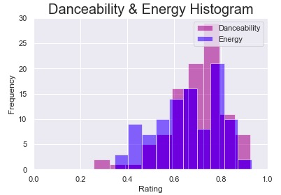
The result would be the beautiful histogram below:
We may even choose to add extra features to the histogram using Seaborn. To this, follow with the lines of code below:
f, ax = plt.subplots(1,1)

sns.distplot(df['danceability'], bins=10,
label='Danceability',	color='purple')
sns.distplot(df['energy'], bins=10, label='Energy',
color='blue')

ax.set_title	('Danceability	&	Energy	Histogram',	fontsize=20)
ax.set(xlabel='Rating', ylabel='Frequency')

ax.set_xlim([0, 1])

ax.legend()
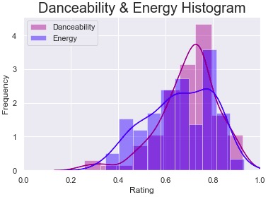
We will get something like the display below:
Comparing Matplotlib Vs Seaborn
To answer the question of whether to use Seaborn or Matplotlib for any specific task, let us now compare Seaborn vs Matplotlib using the basic features and characteristics of Python libraries.
- How They Function
Matplotlib: generally used for creating basic visuals such as bars, lines, scatter plots, pies, etc.
Seaborn: used especially for creating statistical graphs with fewer syntax and more attractive display
2. How They Are Displayed
Matplotlib: It displays a graphical representation that resembles that of MATLAB. And even though it combines NumPy and Pandas really well, the display is still somewhat basic and simple.
Seaborn: it is more compatible with Pandas and creates more attractive visuals clearly and directly. It can also be used to extend the Matplotlib library.
3. How They Handle Multiple Figures
Matplotlib: Matplotlib can handle the opening of multiple figures really well, however closing them requires using certain commands. For instance, explicitly.plt.close() will close only the current figure while plt.close(‘all’) will close all the figures.
Seaborn: opening and closing multiple figures are automatic in Seaborn library but an out of memory error can sometimes occur.
4. How Flexible They Can Be
Matplotlib: it is both powerful and highly flexible. It can be used for a wide array of graphical representations while being easy to manipulate at the same time. This explains why it stands as the foundation for other libraries. It can also be easily customized.
Seaborn: it can do a lot but not as flexible or customizable as Matplotlib. The best thing about Seaborn, however, is that it comes with numerous default themes that you can easily use and apply.
5. How They Can Be Used
Matplotlib: it can be used by all Python libraries and for virtually all kinds of visual representation.
Seaborn: it is not as versatile as Matplotlib but we may consider it an advance version of Matplotlib. Seaborn can be used in specific cases especially for creating representations for statistical data.
6. How They Work with DataFrames and Arrays
Matplotlib: contains numerous objects, dataframes and arrays. It, therefore, has a rich collection of APIs that can be used for plotting different graphs without the need to manage parameters. The aces and figures needed to plot graphs are all represented by the several objects it contains.
Seaborn: while Seaborn is more intuitive than Matplotlib and knows exactly how to work with the entire dataset at once, there is the need to always define and manage parameters. For instance, replot() gives us an entry API and ‘kind’ helps us specify what type of plot we intend to create. Also, we need to pass in an object every time we use the command plot(). We can then say Seaborn does not have as rich a collection of dataframes and arrays as Matplotlib does.
Conclusion
Comparing Seaborn vs Matplotlib is a worthwhile venture but it may not necessarily tell whether to use Seaborn or Matplotlib in any given task. That is not how it is done. To know which of these visualization tools to use, you need to first know what Data type you are working with and also establish what exactly you are trying to achieve. For instance, if you are working with statistical data and trying to create beautiful statistical plots, then it may be wise to use Seaborn.
Creating a comparison of Matplotlib vs Seaborn is not the only thing we do. We also cover other areas of Machine Learning and Data Science, so we encourage you to subscribe to our email newsletter as well as share our articles with your friends.