The Ultimate Guide on Principal Component Analysis in R

This tutorial provides a simple and complete explanation of Principal Components Analysis in R and the step-by-step illustration of multiple practical scenarios in extracting and visualizing data. We further explain how to use Principal Components Analysis in R even without a strong mathematical background.
If you are not familiar with Principal Components Analysis, you will have questions like “what is this Principal Component Analysis?” and “What is the use of Principal Component Analysis?”. Well, first, let’s discuss them. Principal Component Analysis (PCA) is a popular statistical method that lets you reduce dimensionality to identify new underlying meaningful variables.
In Principal Component Analysis, the data is projected to fewer dimensions using some linear combinations among data attributes. Reducing the dimensionality of a dataset makes the exploration and visualization processes much easier. PCA allows you to identify similar groups of samples and the variables that make the groups different from each other.
In simple words, PCA is a technique that converts a large number of variables to a set of small number of variables in a dataset while reducing the data loss as much as possible. This reduced set of variables are known as Principal Components. Each of these Principal Components has a linear combination with the original set of variables.
Assume a dataset with n number of variables as x1,x2,x3 ,x4…xn . Then the Principal Component (PC) can be defined as follows.
PC = a1x1 + a2x2 + a3x3 + a4x4 + … + anxn
a1,a2,a3 ,…an values are called principal component loading vectors.
All these computations are extremely easy when you perform PCA in R.
Now you should have a basic knowledge of what the principal component analysis is. It’s time to learn PCA in R. We will use statistical techniques and concepts like mean, variance, and Standard deviation in this tutorial. If you are not familiar with these basic statistical concepts, I recommend you to have a good idea about that before reading the next part of this article.
Principal components analysis in R
This section will illustrate a PCA example in R using a simple dataset called “LifeCycleSavings. It’s an in-built dataset in R that consists of information about savings ratio in the 1960 – 1970 period. Before moving to the implementation of PCA analysis in R with this dataset, let’s identify the variables in this dataset.
LifeCycleSavings data frame contains 50 observations on 5 variables. Those variables are as follows.
| Column | Description | Data Type |
| sr | Aggregate personal savings | Numeric |
| pop15 | Percentage of population under 15 | Numeric |
| pop75 | Percentage of population over 75 | Numeric |
| dpi | Per-capita disposable income | Numeric |
| ddpi | Percentage of the growth rate of per-capita disposable income | Numeric |
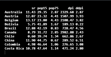
Let’s check the structure of the dataset using the head() function in R.
head(LifeCycleSavings,10)
Computing PCA in R
R principal component analysis can be done in two ways, either using in-built functions in R or through manual computations. In this tutorial, we take a look at how to do PCA with in-built functions in R.
There are multiple methods available in several different packages in R for computing PCA. prcomp() and princomp() are two methods in R built-in stats packages for the purpose. PCA function in R belongs to the FactoMineR package is used to perform principal component analysis in R.
For computing, principal component R has multiple direct methods. One of them is prcomp(), which performs Principal Component Analysis on the given data matrix and returns the results as a class object. Here you can find more details about the prcomp()method, including all the parameters of the method.
So, we can apply the prcomp() method on the LifeCycleSavings dataset as follows. We have used two optional parameters in the function. With the scale option, you can scale the variables to have a standard deviation of 1. The next optional parameter we have used is the center. It centers the variables to have a mean zero.
pca_LifeCycleSavings <- prcomp(LifeCycleSavings[,c(1:5)], center = TRUE,scale. = TRUE)
summary(pca_LifeCycleSavings)
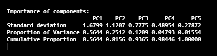
Here, we have five Principal Components called PC1, PC2, PC3, PC4, and PC5. In this image, the 2nd row gives the proportion of the variance in each Principal Component. According to the obtained values, 56% of the information in the dataset can be described with the PC1 Principal component. Same as that, the proportion of the variance that is described by the PC2 Principal Component is 25%.
Now let’s look at the components included in the pca_LifeCycleSavings object, which we obtained in the prcomp() method.
names(pca_LifeCycleSavings)

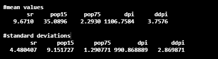
Here, the center gives the details about mean values, and the scale component gives the details about standard deviation.
pca_LifeCycleSavings$center
pca_LifeCycleSavings$scale
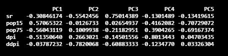
The next important component is the rotation component. It is a matrix, and it gives principal component loadings.
The component x in the resultant object contains the coordinates of the individuals (observations) on the Principal Components. The prcomp function also outputs the standard deviation of each Principal Component, which can be identified as sdev in the resultant object.
Plotting results of PCA in R
In this section, we will discuss the PCA plot in R. Now, let’s try to draw a biplot with principal component pairs in R. Biplot is a generalized two-variable scatterplot. You can read more about biplot here. I selected PC1 and PC2 (default values) for the illustration. If you need to plot another two principal components, you can use the choices option in the biplot() function. We can use the ggbiplot package for the PCA plot in R.
Before plotting the values, we need to install the ggbiplot package as follows.
library(devtools)
install_github(“vqv/ggbiplot”)
Now you can plot the graph using the biplot() method.
library(ggbiplot)
ggbiplot(pca_LifeCycleSavings)
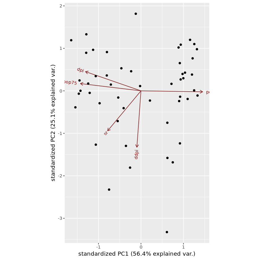
In this graph, red color arrows are the axes. But if you don’t know related points and samples, this graph doesn’t give much information about the dataset. We can mention the related samples using labels optional parameter in the biplot function.
ggbiplot ( pca_LifeCycleSavings, labels=rownames( LifeCycleSavings ) )
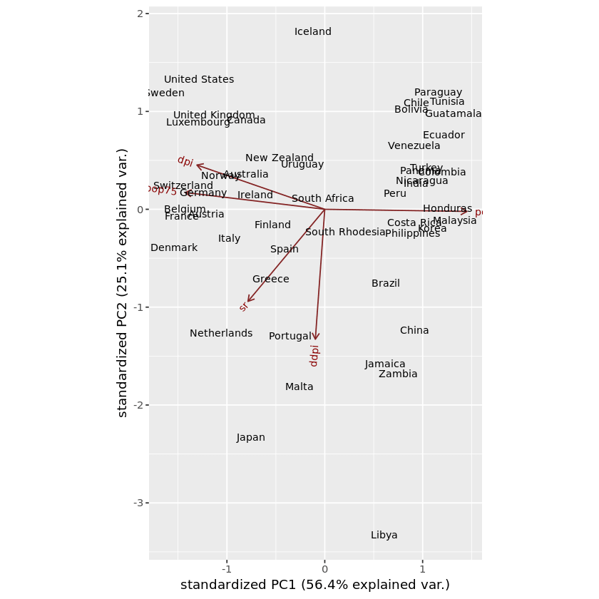
In this plot, you can identify which samples are similar to each other and which samples are different. We can categorize the data in the dataset and visualize it in the graph using the same ggbiplot() method. For that, first, it’s required to create the list of groups. Then pass the created object, which contains group information, to the optional parameter called groups in the ggbiplot() function.
ggbiplot(pca_LifeCycleSavings,ellipse=TRUE, labels=rownames(LifeCycleSavings), groups=LifeCycleSavings.country)
Here LifeCycleSavings.country is the name of the object that includes group information.
ggbiplot() function contains multiple other optional parameters as well. Some of them can be mentioned as follows.
- obs.scale = scale factor to apply to observations (Takes a numerical value)
- var.scale = scale factor to apply to variables (Takes a numerical value)
- circle = draw a circle in the middle of the dataset. (Takes a boolean value)
- var.axes = remove the arrows in the graph (Takes a boolean value)
- labels.size = change the font size of the labels of the samples (Takes a boolean value))
Principal Components Regression in R
Principal Component Regression (PCR) is a regression technique based on Principal Component Analysis. PCR is important in cases where a small number of Principal Components are enough to represent the majority of variability in data. There are multiple advantages in using Principal Component Regression, such as Dimensionality reduction and overfitting mitigation.
For this example, we will use the pls package to perform PCR on our dataset in R. To perform principal component regression R contains a method called pcr.
require(pls)
set.seed (1000)
pcr_model <- pcr(pop15~., data =LifeCycleSavings , scale = TRUE, validation = “CV”)
Here we have used cross-validation as the validation technique, which is indicated as“CV”. Then You can print the results with the summary method. After initializing pcr_model, you can try to use PCR on a training-test set and evaluate its performance.
The evaluation can be implemented as follows.
pcr_predict <- predict(pcr_model, test, ncomp = 3)
mean((pcr_predict – y_test)^2)
Conclusion
Great!! That’s pretty much about Principal Component Analysis in R. In this tutorial, we discussed what principal component analysis is, its purpose, and the methods we can perform PCA in R. Next, we briefly discussed Principal Component Regression in R as well. Furthermore, I illustrated a Principal Component Analysis R example to understand the concepts well.
If you are looking for more ways to learn statistical methods such as principal component analysis, subscribe to our newsletter. Feel free to share this article to spread the insight with your friends and colleagues, and also don’t forget to join our Udemy course to learn statistical methods in R quickly.