Top Python Libraries and Techniques for Awesome Data Visualizations

When it comes to data visualization with Python, a developer is usually presented with a myriad of options. There are numerous libraries for data visualization in Python. And while they all do the same thing; visualization of data, the type of data visualization, and the specifics of the entire process of data visualization differs from one library to the other. Developers usually select the data visualization library to use based on what they are trying to accomplish and the result they have in mind.
In this article, we will consider some of the most common python visualization tools, consider also their unique features, and what is so good or bad about each of them.
What is The Data Visualization Libraries in Python?
Python visualization libraries are special Python libraries that make it possible to display data sets through graphical representations. These tools that are becoming increasingly important in the machine and deep learning are used by developers to map data values and graphics thereby giving us a better and clearer idea about the data sets in question. The increasing attention is arising from the fact that reactive colors are better for the human eyes compared to written texts.
These data visualization tools Python has built are purposefully designed to assist developers in creating customized data graphs that are both interactive and live. Simply put, they help us place large data sets in a visual context. They make it very easy for developers and programmers to make decisions in the shortest possible time because when placed in graphical format, data becomes easier to understand and the entire concept, easier to grasp.
Whichever library we might want to look at, the usefulness of data visualization can simply not be overemphasized because visualizing information helps us explore data sets with our eyes thereby helping us create some form of information map.
Interestingly, all types of data visualization libraries generally involve the following steps:
- Acquiring: This is the first step where the library collects information about the data we are attempting to visualize. this information includes the size and uniqueness of the data set
- Parsing: Here the library takes all the information it has acquired from the prior step and arranges them all in a proper structure and category
- Filtering: Here, the data set is separated to find the most informative indicator
- Mining: Data mining is important to apply the data in a mathematical context
- Representing: This is the fun step where the library can choose the method of visualization. It could be a bar graph, a chart, a list, or a tree
- Refining: Once the basic mode of representation has been picked, the library can then refine it using sizes, shapes, colors, scales, and labels to improve it so it becomes clearer
- Interacting: This is the final step and involves manipulating the data to decide the features that are visible to the viewer
Below we will consider the top 5 Python visualization tools to see what is distinct about each of them.
Distinct Features of Each Library, Methodology
1. Matplotlib
When developers were first looking for how to visualize data in Python, Matplotlib was the answer. It is the oldest Python data visualization library known. Matplotlib is considered to be so powerful that there is typically no type of data visualization operation that cannot be done with it.
Distinct Features:
- The foundational library upon which every other python visualization library is built
- Considered to be very versatile supporting about four graphical toolkits plus Python scripts, IPython shell, Jupyter notebook as well as certain web-based application servers
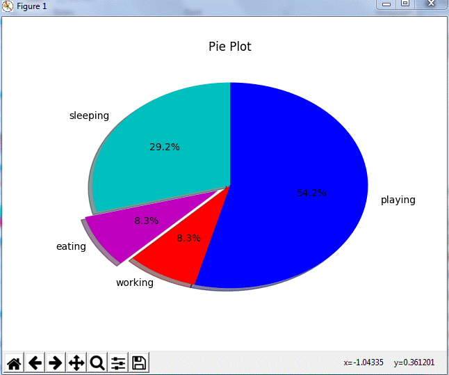
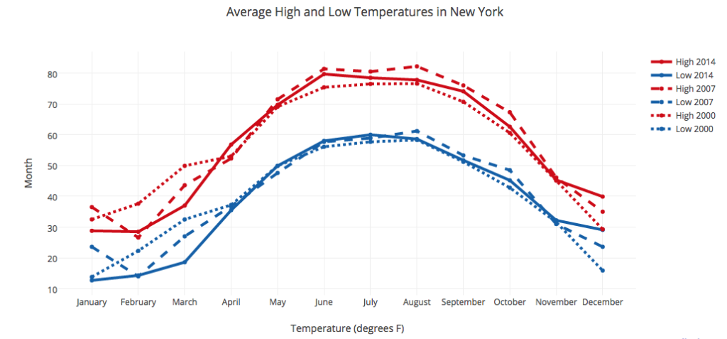
- Can generate visual representations including plots, histograms, bar charts, pie charts, scatterplots, stemplots, error charts, power spectra, etc.
- Allows for absolute control of visualization even at the most granular level
2. Plotly
Plotly has one of the best assemblies of API with Python as one of them. Developers can have a swell time creating a rich array of interactive graphs using this visualization library. Also, with Plotly, you can do both visualization and analytics with very simple lines of code. A thing to note, however, is that Plotly, by default, takes all your work public, but there is the option of keeping your plots private if you want. There is all the information you need in the documentation.
Distinct Features:
- Integrates easily and seamlessly with Pandas and NumPy
- Contains and support a robust collection of APIs
- It can help create interactive graphs, bar charts, and plots
3. Seaborn
Seaborn was developed on the foundation provided by Matplotlib. Seaborn is said to be one of the most beautiful ways to use Python for data visualization. The best thing about this library is how we can easily and quickly create simple plots that are even more visually appealing.
Distinct Features:
- Resembles Matplotlib in functions but with lesser codes
- Makes data visualization more visually attractive by default
- It is built to integrate well with Pandas and NumPy
- Can create simple plots in style adding finer colors and palettes
4. Bokeh
Bokeh is a very flexible library for visualization in Python because it makes visualization via web interfaces and browsers more convenient. Data visualization with Python and JavaScript can be easily done with the library. Visuals, including bar plots, box plots scatter plots, and histograms, are usually produced in three varying levels.
Distinct Features:
- Build visuals that are especially interactive on web applications and browsers
- It is a Python drawing library that also supports streaming and real-time data
- Integrates well with both Python and JavaScript
- Can easily create Network graphs, Geospatial plots, etc
5. Ggplot
Ggplot is a library-based the Grammar of Graphics and the Python version of what developers call ggplot2 in R. Ggplot works pretty well with Pandas and demonstrates one of the best forms of machine learning as it only requires us to fill in the variables and primitives and then it can take care of the rest.
Distinct Features:
- It supports a lot of APIs, however, some of them are not Python-based
- Considered to be very powerful
- Creates simple graphical representations but devoid of any complexities
- Allows for building less customized graphics with little control
Pros and Cons of Python Visualization Tools
All the data visualization tools Python has built have disadvantages just as they have many advantages. To this end, Python data visualization libraries come with pros and cons and we will now be considering a few for each of the tools we have highlighted above.
Matplotlib
Pros:
- Very powerful and versatile
- Allows for absolute control of the visualization process
- Provides a highly interactive environment across several platforms
- As a proprietary library, it provides a lot of options
Cons:
- Requires more codes than the other types of graphical tools
- Not very easy or quick to use.
- Harder to create high-quality charts
- Comes with an archaic style and feel
Plotly
Pros:
- Contains some of the most robust collection of APIs
- Code editing can usually be done online by users
- Charts can be easily shared since the tool is hostable on servers
- Relatively simple to use and work with
- Best for creating highly interactive graphs and plots
- Effortlessly integrates with Pandas
Cons:
- Because it requires a lot of power, it can sometimes become very slow
- Not exactly free and the free version comes with a lot of limitations
- Charts can appear confusing to first-time users
- Data is set to always go public by default
Seaborn
Pros:
- Creates very colorful graphs and plots
- Requires only very few lines of code
- It is a free and an open-source library
- Charts are very visually attractive
Cons:
- Offers only limited types of charts
- The support system is not the best
Bokeh
Pros:
- Works excellently with web applications and browsers with amazing visualization abilities
- Offers additional benefits including streaming and real-time data visualization
- Can create numerous highly interactive charts
- Merges Python and JavaScript rather too easily
Cons:
- May be too expensive to work with
- Formatting may prove challenging to new users
Ggplot
Pros:
- Can be tightly integrated with Pandas
- Can handle every other detail after it has learned both the variables and primitives
- Creates declarative graphics in very few and easy lines of code
Cons:
- The library is barely designed for customized graphical representations
- A free version, even though available, may be greatly limited
Useful Tips for Python Visualization Tools
The Python visualization libraries we have looked at aside from being useful in data analysis and visualization can also be used in other operations such as engineering algorithms, design aesthetics, and even basic mathematics.
But here are a few tips to help you use data visualization libraries more efficiently:
- All visualization libraries are great, but it is always advisable to select the one to use according to the task you wish to accomplish
- It is always also advisable to at least have some basic foundational knowledge about data visualization and data visualization tools before jumping in to create graphics
- You may also be required to have a little knowledge of how to write codes. Even though most of them, except Matplotlib, only requires very few lines of code
- It is not always advisable to try to create a graphical representation that is perfect even though most of these tools can offer you something very close to perfect
- With some of these tools, it may be wise to have a large storage capacity as graphics can consume a lot of computing space
- When using a library that allows your data to go public by default, it is always advisable to first it to private before commencing work except, of course, you don’t mind being public
Conclusion
Power, Convenience, Style. These are some of the terms that come to mind when you mention Python visualization tools. They simply take large complex data sets and turn them into visuals that are very easy to read and interpret. They make the job easier for developers and, for this reason, and more, Python graph visualization is becoming even more common.
We may dive deeper into data visualization or explore other interesting areas of machine learning. So don’t forget to subscribe to our email newsletter so you don’t miss out on anything. Your friends would also like it if you shared this article with them, won’t they?