Which Business Intelligence Tools Should You Learn: In-depth Comparison

There’s a big demand for Business Intelligence analysis skills these days.
Business Intelligence tools (BI tools) have enabled organizations to get revealing insights into their operations and processes and use them to improve productivity, boost revenue, cut costs, etc.
The ascendance of Business Intelligence to the highest priority of most companies has meant that BI Analysts are highly sought after. One of the main skills that a BI analyst needs is the ability to use BI tools such as Tableau, MS Power BI and Qlik Sense, to their full potential.
Demand for BI Analysts means that companies are willing to pay top dollar for highly skilled people. For instance, Tableau Certified Associates can earn up to $138,000 and Tableau Certified Professionals can earn up to $152,000 (source: Glassdoor, figures correct at time of writing).
So, if you’re looking to train as a Business Intelligence Analyst, learning one or more of the top BI tools is essential.
For this guide, we’ve chosen to examine the top business intelligence tools. These are BI software platforms that cover data discovery, analysis, visualization and insights, to varying degrees. The top three BI tools are:
- Tableau vs Power BI vs QlikSense
We’ll begin by looking at the features and functions that each tool provides, some examples of applications, and finish with a final comparison of each tool.
Tableau: Pros and Cons
One of the claims on Tableau’s website is “Tableau helps people see and understand their data”.
This pretty much neatly sums up what Tableau does.
But beneath the simplicity of their aim, Tableau offers powerful and sophisticated data collection, analysis and visualizations.
Tableau consists of 3 main products for data discovery:
1. Desktop – Connects and analyzes data from disparate sources, quickly creating insightful reports from these large datasets.
2. Server – Allows users to securely share data and insights on the same server, which encourages collaborative research and work.
3. Online – This is the cloud version of “Server”, and does the same thing without the need for hardware installation, and it also supports mobile access.
Tableau also offers three additional products:
1. Mobile – Companion app for Tableau Online, enabling streamlined access to data and analytics on tablet and mobile.
2. Public – This is a free version of Tableau Desktop and Online, that is only for use with data that is to be shared openly and publicly.
3. Prep – A recent addition that is an advanced data preparation tool, allowing complex tasks such as joining and pivoting tables to be done easily by dragging and dropping icons.
Tableau Features
Tableau allows users to drill deep into data, create powerful visualizations to analyze the information, and automatically produce valuable business insights. Here we’ll list some of the main features that enable this.
Wide Range of Data Connections
One of the main strengths of Tableau is that it can automatically connect with hundreds of data sources without any programming needed, including big data providers. Here are just a few of the sources it instantly connects with: Hadoop, Cloudera, Google Analytics, Google Sheets, MS Office, Salesforce, MongoDB, Dropbox, Amazon Athena, etc.
Switching Between Live and In-memory Data
Tableau allows users to instantly switch between live data connections and pre-extracted data. You can also schedule extract refreshes and get notifications when live data connections fail.
Easy-to-use Interface
Tableau BI tool is designed to be user friendly, with most integration taking place through drag-and-drop icons. You can quickly create visuals from data by dragging the icon for the relevant data set into the visualisation area. In other words, you can access visualisations that reveal important insights within a few clicks.
Application Plug-ins
A useful time-saving feature of Tableau is that you can embed dashboards into some existing apps, such as Jive, Salesforce and SharePoint. This allows you to pull up quick analytics and visualisations when you need them, without leaving the app.
Unlimited Number of Data Connections
Users can connect to any number of compatible data sources on-site or through the cloud.
Secure Collaboration
Users can collaborate securely across networks or the cloud, using Tableau Server and Tableau Online. This allows rapid sharing of insights, meaning that people can take action more quickly to save costs or make more money for the business.
Mobile Device Versatility
Tableau includes a Device Designer tool, allowing people to customize and design their own dashboards to fit tablets and phones.
Different Levels of Technical Support
Tableau offers four levels of support, depending on your needs:
- Complimentary – Free access to Knowledge Base and Tableau Community to answer basic questions.
- Technical Support – Automatically included when you buy a one-year licence. It covers multiple locations and provides live support for minor to critical issues.
- Elite Program – Elite gives you a designated technical manager who has the power to prioritise your issues, with 24/7/365 support available.
- OEM Program – If you have Tableau installed on-site, you’ll get all the Technical Support services, as well as being assigned a Partner Support Engineer to sort out any integration issues.
Learning to Use Tableau
Tableau provides some basic tutorials and training in the complimentary support resources. These are good to get you started, but if you want to use the tool to its full potential, you’ll need some extra training.
If you’re keen to learn more, we have three in-depth Tableau courses available:
- Tableau Certification Course – Comprehensive course that teaches you everything you need to know to pass the associate exam and become a qualified Tableau expert.
- Tableau Training Course – For all levels from beginner to advanced, everyone will learn to use Tableau to its full potential.
- Tableau Advanced Training – For advanced users only, this course takes you to a mastery level.
Microsoft Power BI Tools Review
Microsoft Power BI is a business intelligence and data analytics tool, which is cloud-based and free at the point of entry, with a premium Pro version available for more advanced features.
MS Power BI allows you to see an overview of your important data on a detailed dashboard, as well as create visualisations to reveal business insights. Microsoft BI tools connect with most small and large data sources, including MS Excel, Hadoop, Cloudera, Google Analytics, Google Sheets, etc.
The main selling point of Power BI is its simplicity. Microsoft has worked hard to make the software as intuitive and easy-to-use as possible. Most features work by dragging and dropping data, and it’s easy to create customized visualizations, reports and embedded visuals.
There are two main products available:
Power BI Desktop – The main cloud-based platform which is free to use, but upgradeable to “Pro” and a “Premium” versions.
Power Bi Mobile – Mobile app version with same functionality as Desktop, enabling you to view your business data from anywhere at any time.
Power BI Main Features
There are three main features of MS Power BI:
Datasets
Power BI gathers disparate data from all your sources, storing them all in one place. Making all the data centrally available speeds up analysis and the creation of visualizations and data insights, thus speeding up the process of making data-backed business decisions.
Dashboards
Power BI creates dashboards for each dataset, which are interactive panels that display and correlate data, using smaller panels called tiles. Dashboards allow users to easily compare and evaluate multiple datasets. They also allow information to be exchanged quickly by sharing the dashboards directly with others in the organization.
Reports
Custom reports can be created from the results of data analysis. Once complete, the reports can be imported to any dashboard to enable fast sharing between colleagues.
Additional Power BI Features
Q&A Query Box
This feature allows you to search and explore the data by asking a natural language question. The software will use autofill, rephrasing technology, suggestions, and other AI features to find the right answer as quickly as possible.
Help and Support
The main interface includes buttons for getting support or providing feedback. The support button links to a help database online, and if you still can’t solve the problem, provides a link to one-to-one MS chat for further assistance.
Subscription Plans
As Power BI is a cloud-based app, it runs on a subscription model, with three levels:
Desktop – The basic version is free for individual users.
Pro – The Pro plan costs around $9.99 a month and enables collaboration and sharing through the cloud.
Premium – The Premium plan costs around $4,995 per month, per dedicated cloud compute and storage resource. This plan is aimed at enterprises using big data and on-site reporting, as it allows cloud computing and storage. It also allows any user in the company to use the Power BI results.
Learning to Use Power BI
MS Power BI is an ideal solution for businesses that are looking for a simple BI tool that does the job. Although the basic features are fairly easy to learn, using the more advanced tools and functions requires extra training.
We offer a complete course that teaches you to use all the features to their full potential. Check out our comprehensive Power BI Course here.
Qlik Sense Review
Qlik Sense is a data exploration and visualization tool for businesses that is highly versatile. It’s intuitive enough to be used by a non-technical person, yet powerful enough to be of use to data experts. In other words, it can be used by anyone within a company or organization, at an appropriate level.
Qlik Sense’s versatility is the main point that sets it apart from Tableau and Power BI. The fact that any user can use the basic features, means that analysis and insights can be shared across the entire organization quickly and with ease.
The structure of Qlik Sense uses Application Program Interfaces (APIs) which means that developers can embed Qlik Sense directly into the interfaces of other applications. This means that Qlik Sense can be customized and optimized to suit the organizations needs. For example, if they want to embed Qlik Sense’s visualization tools into an internet browser to keep data insights front and center of the business, this can be done.
Qlik Sense Features
Qlik Sense boasts a lot of dynamic features that increase the versatility of the tool.
Smart Search Function
A prominent search bar uses intelligent algorithms to search for the keywords and phrases you input. It quickly locates and returns data sets, graphs, charts, reports, visualizations, and more.
Central Data Management
Qlik Sense gathers all disparate data into a centralized data set. The platform also acts as a central location to analyze and display data, share insights, and develop apps.
Simple Visualization & Report Creation
The dashboard enables the creation of drag-and-drop visualizations and reports. No need for coding, scripting, SQL queries or database joins.
Data Visibility
Qlik Sense doesn’t hide data in the same way that other tools do. Instead it grays out irrelevant data, rather than disregarding it entirely. This means that advanced users can still uncover hidden trends.
Interactive Visualizations & Reports
Users can change data, dimensions and context, and the visualizations will automatically update.
Data “Storytelling”
Qlik Sense allows multiple viewpoints to be shared simultaneously when giving context to data. Users can create a “data story” from the original analysis to the final visualizations and insights.
Qlik Sense Versions
Qlik Sense is available as four different versions:
1. Desktop – Individual-user version that can be downloaded and installed in a desktop environment. Comes with unlimited data source access and all Qlik’s main features.
2. Enterprise – Subscription, server or user pricing models. Enterprise comes with the same features and access as desktop, but can be used across a server once licences are purchased.
3. Cloud Basic – Cloud Basic is a free SaaS version of Qlik Sense that can be accessed by up to five users.
4. Cloud Business – The same SaaS offering as Cloud Basic, but extended for unlimited sharing at a cost of $15 for each user per month.
Mobile – There is also a mobile app as part of the enterprise subscription that allows users to view visualizations and reports on the move.
Learning Qlik Sense
As we mentioned above, Qlik Sense caters for all users, from basic non-technical people to advanced business intelligence analysts or data scientists.
For this reason, we’ve developed two courses to help you get to grips with Qlik Sense at different levels.
The Qlik Sense for All Levels Course is a comprehensive course that covers beginner to advanced topics.
If you want to level up your skills from intermediate to master, check out our Qlik Sense Masterclass here.
BI Tool Use Cases
In this section, we are going to examine a common use case for each of the three BI tools – importing data and creating a data visualization. We’ll go through a mini-tutorial on how to achieve this for each tool.
By demonstrating the process of this simple use case for each tool, we hope to highlight some of the main strengths and weaknesses.
Tableau Use Case – Create a Scatterplot
For this example, we are using a dataset of Top Movies of the 2010’s, which is available for download here.
The first step is to open Tableau, create a new dashboard and click on the Data tab. Then open File Explorer (or Finder on Mac) and navigate to the data .csv file. Simply drag the .csv file icon into the Tableau window and drop it in to connect the data.
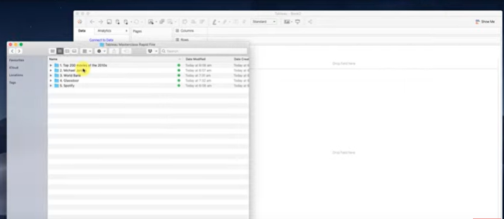
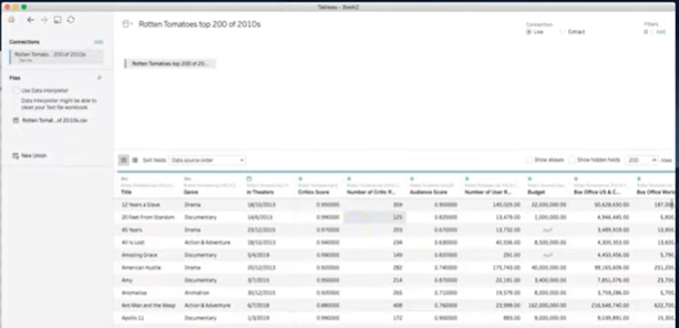
You should see something similar to the picture above, with the movie data listed in the main window and on the left-hand side bar the data file listed under Connections. If we wanted to add more data, we could simply drag and drop each file across, a process which takes seconds.
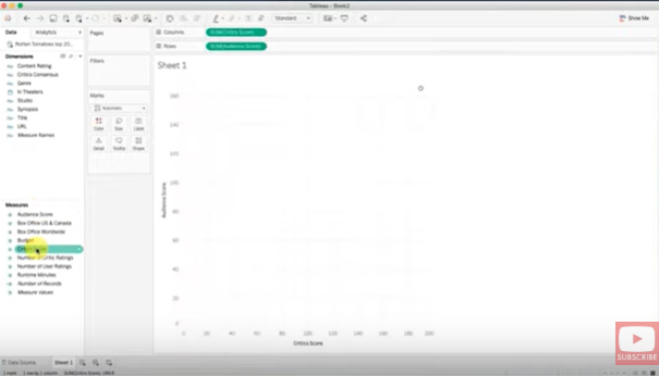
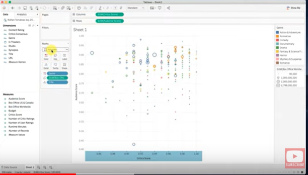
Now the data is connected, we can move on to creating the visualization. Simply click the Sheet 1 tab at the bottom of the window to open the visualization tool. We’ll begin by selecting the data we want to analyze, for this example we’ll select Audience Score and Critic Score from the left hand side-bar.
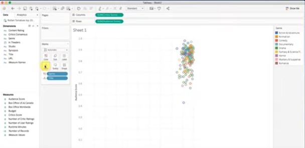
We now decide how to display the data. In this case we’ll select Genre from the Measures menu and drag and drop it onto the Color icon in the Marks section. In a similar way, drag Title from Dimensions onto Details. This creates a scatter plot in the main window, with different genres designated by different colors, with Audience score on the y-axis against Critic score on the x-axis.
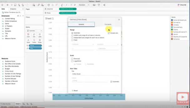
To zoom into the data, we’ll unhinge the axes, by right clicking on each axis one at a time and deselecting “Include Zero”.
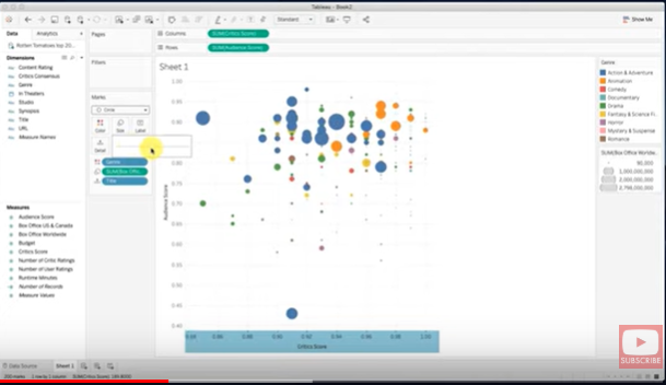
We can compare data further by adding more variables to the marks section. For this example, let’s drag and drop Box Office Sales Worldwide onto Size, which changes the size of the marks, proportional to box office sales.
We can change the appearance of the points quite easily by selecting the drop down menu in the Marks section, select Circle, change the size, and also add a border.
Finally, we can drag Synopsis onto the Tooltip mark, which means when you place the cursor over each point it will display the movie synopsis.
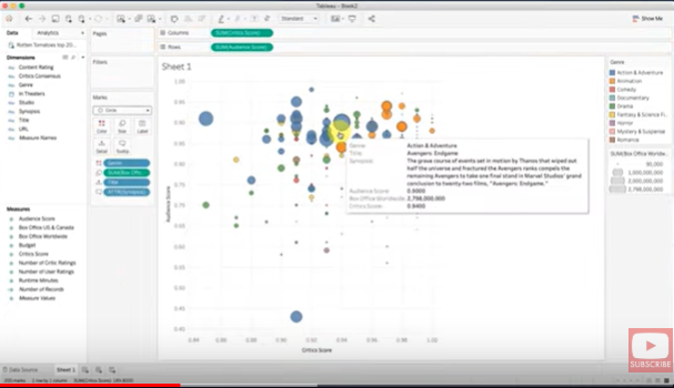
As you can see, it is very straightforward and fast to import data and create a simple, yet detailed, visualization using Tableau. This whole process should take less than five minutes, and as you get more proficient and familiar with the platform can be done in less than a minute.
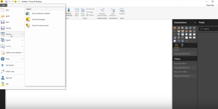
Power BI Use Case – Create a Scatter Plot
For this example, we’re using the same dataset as the previous example – Top Movies of the 2010’s, which is available for download here.
Firstly, open a new Power BI desktop session. Then go to File – Import and select the .csv to import.
Now that the data is imported, the next step is to create the data visualization. Simply click the Scatter Graph icon in the Visualizations toolbox, then click and drag to place it in the dashboard. Then select the fields one by one to create the x-axis and y-axis variables respectively.
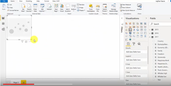
You can also choose a field to add as a dimension attribute. To change the appearance of the scatter plot marks, simply click in the Details window and change use the drop down menus.
This process in Power BI can be done in just one to two minutes, even by a beginner. The appearance is similar to MS Office products, so it’s very familiar and easy to use.
The main downside of Power BI when creating visualizations compared to Tableau, is that it is more difficult to add special features, such as the Tooltip feature which adds more context to the graph. In Tableau, it’s a simple case of dragging and dropping a field onto the tooltip icon, in Power BI, you need to locate the Tooltip menu, then use the dropdown menu to select the relevant field.
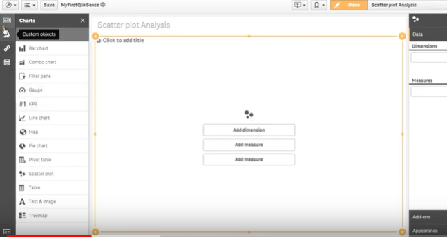
Qlik Sense Use Case – Create a Scatter Plot
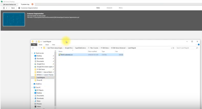
For this use example, we are using a .csv file containing fictitious bank customer details.
Begin by opening up Qlik Sense and creating a new app. Next, open file explorer and find the .csv file. To import the data into Qlik Sense, just drag and drop the file icon into the Qlik Sense window.
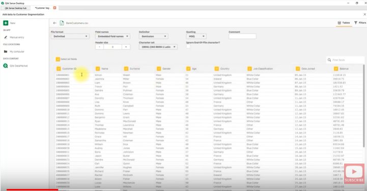
The data is automatically imported and assigned. Simply click Add Data which connects the data to the app.
Next, click the Analysis tab and click Edit. In the analysis window, double-click Scatter Plot from the left hand menu.
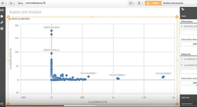
Now we need to add dimensions and measures. Select two measures to represent the x-axis and y-axis, and a third measure as the values of the scatter plot marks or points. We can also add dimension fields to give the marks attributes. To do this, click fields from the icons on the left-hand side, select All Tables from the drop down menu, then drag and drop the measures and dimensions you want to use.
You can then adjust the size, shape and color of the marks by clicking the Appearance tab on the right-hand side.
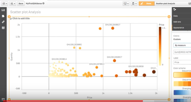
Creating a data visualization with Qlik Sense is a slightly longer process than with Tableau or Power BI, due to the slightly more complicated interface and lack of complete drag and drop functionality. Beginner users will probably take five minutes or more to create a simple visualization like a scatter plot.
Also, the overall appearance of the final scatter plot is also less slick and interactive as the one created with Tableau, for instance.
Power BI vs Tableau vs Qlik Sense
To complete this guide to BI tools, we’ve taken an in-depth look at the features and capabilities of best bi tools, analyzed each tool and compared them in the following table.
We tried to make Tableau vs Power BI as well as Qlik Sense vs Tableau comparison as detailed as possible for you to make own conclusions.
| Tableau | Power BI | Qlik Sense | |
|---|---|---|---|
| Data Sources | The widest range of data sources and servers of the three. More than 50 compatible data sources. E.g. MS SQL, Oracle, IBM, Amazon Redshift, Google BigQuery, etc.* | Limited range of data sources and servers. Approximately 25 compatible data sources. E.g. MS SQL, Oracle, IBM, Amazon Redshift, Google BigQuery, etc. | Limited range of data sources and servers. Approximately 20 compatible data sources. E.g. Amazon Redshift, Google BigQuery, MS SQL, etc. |
| Data Capacity | 100 GB of data. Uses columnar based structure to allow billions of rows. | Each workspace can handle 10 GB of data. For more than 10GB it needs to connect to Azure cloud services. | 10 GB of data, but scalable through the QIX data engine. |
| Visualizations | 24 types of baseline visualizations including heat maps, scatter plots, line charts, etc. Can use any number of datapoints in the visualizations. | 27 types of baseline visualizations. Easy to import datasets (drag and drop) and simple insertion into visualizations. Can use natural language queries to create visualizations through Cortana. Users are limited to 3,500 datapoints. | 27 types of baseline visualizations. Visualizations are highly customizable. The maximum number of data points that can be used is 10,000. |
| Reporting | Powerful reporting tools, allows reports to be shared easily between users. | Basic reporting features. Unable to publish reports and associated data together. | Good reporting tools. Performs best in ad-hoc reporting and data transformation. |
| Interface (UI) | Steep learning curve for non-technical executives and employees. Intuitive drag and drop visualization tools. Able to embed dashboards in other business apps such as SharePoint. | Interface is similar to MS Excel, so it’s very familiar and easy-to-use. Simple drag and drop visualization tools. | Intuitive drag and drop interface makes it easy to move data around and create graphics. Data modelling and dashboard are displayed in the same interface, speeding up the the creation of visualizations. |
| Machine Learning | Python language is built-in along with its machine learning capabilities to use with datasets. | Integrated with MS Azure, which applies machine learning to analyze data, understand trends and patterns. Supports R language also. | Uses built-in Qlik cognitive engine. Doesn’t support R or Python. |
| Target Users | Novice users, intermediate users, advanced users, BI analysts. | Novice users, intermediate users, advanced users. | Novice users, intermediate users, advanced users. |
| Example Clients | Pandora, Deloitte, Citrix | Canon, Fila, Cisco, McAfee | |
| Tech Support | Direct support by phone, email or online portal available. Different levels of support are available, depending on price of subscription. Online knowledge base, community forum and training resources available for free. | Limited for free users. Paid users get priority service. Support resources and forums available online. | Direct online support through portal. Online community forum and knowledge base. |
| Pricing | $12 per month for Tableau Viewer, which allows to view and interact with dashboards and visualizations. $35 per month for Tableau Explorer, which allows self service analytics. $70 per month for Tableau Creator that allows full functionality. | Free to $9.99 for desktop use. Full cloud computing service from $4,995 per month. | 30 day free trial available. $30 for Business SaaS version that runs on a local server. $40 to $70 for Enterprise cloud services for enhanced analytical computing power. |
It’s fair to say that all three tools, Tableau, Power BI and Qlik Sense are powerful tools for any business to use, so it is not easy to answer which business intelligence tool is the best. From the comparison table above, however, it becomes clear that for small businesses, Power BI may have the slight edge as it has a free option and is easier to learn, although it lacks some of the powerful features of the other two.
From a Business Intelligence Analyst’s point of view, Tableau comes out on top due to the sheer number of data sources available, the advanced analytic tools and the ability to apply Python scripts and machine learning features. The superior technical and online support for Tableau also makes it more attractive for professional users.
* Tableau Data Sources Full List: Excel, Text File, Access, JSON File, PDF File, Spatial File, Statistical File, Other Files (such as Tableau .hyper, .tds, .twbx), Connect to a Published Data Source on Tableau Online or Server, Actian Matrix, Actian Vector, Amazon Athena, Amazon Aurora, Amazon EMR, Amazon Redshift, Anaplan, Apache Drill, Aster Database, Box, Cisco Information Server, Cloudera Hadoop, DataStax Enterprise, Denodo, Dropbox, EXASOL, Firebird, Google Analytics, Google BigQuery, Google Cloud SQL, Google Sheets, Hortonworks Hadoop Hive, HP Vertica, IBM BigInsights, IBM DB2, IBM PDA (Netezza), Kognitio, MapR Hadoop Hive, Marketo, MarkLogic, MemSQL, Microsoft Analysis Services, Microsoft PowerPivot, Microsoft SQL Server, MonetDB, MongoDB BI Connector, MySQL, OData, OneDrive, Oracle, Oracle Eloqua, Oracle Essbase, Pivotal Greenplum Database, PostgreSQL, Presto, Progress OpenEdge, QuickBooks Online, Salesforce, SAP HANA, SAP NetWeaver Business Warehouse, SAP Sybase ASE, SAP Sybase IQ, ServiceNow ITSM, SharePoint Lists, Snowflake, Spark SQL, Splunk, Teradata, Teradata OLAP Connector, Web Data Connector, Other Databases (ODBC)
** Power BI Data Source Full List: SQL Server Database, Access Database, SQL Server Analysis Services Database, Oracle Database, IBM DB2 Database, IBM Informix database (Beta), IBM Netezza, MySQL Database, PostgreSQL Database, Sybase Database, Teradata Database, SAP HANA Database, SAP Business Warehouse Application Server, SAP Business Warehouse Message Server (Beta), Amazon Redshift, Impala, Google BigQuery, Snowflake, Exasol.
*** Qlik Sense Data Source Full List: Amazon Redshift, Apache Drill (Beta), Apache Hive, Phoenix (Beta), Apache Spark (Beta), Azure SQL, Cloudera Impala, Google BigQuery, IBMDB2, Microsoft SQL Server, MongoDB (Beta), MySQL Enterprise, Oracle, PostgreSQL, Presto, Sybase ASE, Teradata, Essbase, ODBC, Salesforce